
Microsoft Power BI is a set of tools to transform unrelated sources of information into logical, visually appealing, and interactive insights. Creating a unique dashboard with real-time data that is easy to understand Power BI is handy.
Power BI can integrate with other Microsoft services and different types of data sources, making it one of the most popular visualization products. To create dashboards and reports for analysis we can also input data from various popular sources, such as webpages, PDFs, CSV files, and SharePoint.
People who come from Excel backgrounds think dashboards and reports are interchangeable data visualization tools. If you are used to creating experiences filled with data, bar charts, column charts, and line charts all on one page then it’s an understandable mistake. There is the main distinction between these two items in Power BI, as they serve unique purposes. Let’s compare Power BI Dashboard vs Report to have a clear understanding of these two.
In this blog, we will learn more about Power BI functionality, strengths, and best use cases for Dashboards and Reports, and we will learn about how they complement each other in delivering comprehensive data insights.
Key Takeaways:
Power BI provides dashboards that provide a high-level, non-interactive overview of key metrics and real-time monitoring. Power BI generates that type of reports that offer in-depth, interactive analysis across multiple pages, making them suitable for detailed data exploration and decision-making.
Dashboards are the best choice for executives and decision-makers who need to monitor key performance indicators. It also provides detailed analysis, trend identification, and data interaction, reports provide the depth and functionality needed.
When we are creating a dashboard, we must ensure to keep it simple and focused on the most critical data. When we are making reports, we must ensure data is clean, relationships are correctly established, and visuals are not overcrowded to provide a clear and accurate representation of the data through analysis.
What is a Power BI Report?
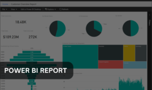
We can make Power BI reports highly interactive and customizable in-depth analysis tools that can span multiple pages, and all contain as many visuals like charts, graphs, and maps as we want. They are interactive representations of data insights, allowing users to analyze data by exploring visual elements.
For example, we can click on a data point in a bar chart to affect a line chart on the same page. We can also apply filters and slicers to customize the view of the data and focus on specific areas of interest. We can also connect reports to live data sources, or we can be scheduled to refresh automatically so we are always up to date. We can use Power BI Desktop to generate reports.
Benefits and use of Power BI Reports
We can analyze and present data as per our requirements using Power BI reports sales and marketing teams can analyze sales data, track performance against targets, identify trends, and provide insights into customer behavior. Financial teams can monitor budgets, forecast revenue, and generate financial statements. Human resources use it to analyze employee data, track recruitment metrics, and assess training effectiveness. The list goes on.
In Power BI dashboard vs Report when you aim to make data-driven decisions Power BI reports are great. We can easily share them across departments for easy collaboration and because data is in an easy-to-understand format, all stakeholders can digest the information.
What is a Power BI Dashboard?
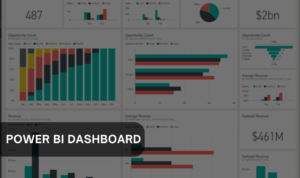
Power BI dashboard is quite different like the dashboard is a high-level, non-interactive overview of the information presented on a single page. Power BI presents the key metrics you want to track without the detailed analysis you get from reports.
To create a dashboard, we must build a report on the Power BI desktop and have to publish it to the Power BI dashboard service. So, from there, we can pin visuals from your report to a dashboard and link them back to specific pages in the report.
Use and Benefits of Power BI Dashboard
For those executives and decision-makers who need a high-level overview of key performance indicators (KPIs) without delving into the details, the dashboard is great for quick views and summaries, not detailed analysis. In Power BI Dashboard vs Report, the dashboard lets you focus on the most critical data points for quick, and data-driven decisions.
Teams can monitor sales performance in real-time, tracking total sales, revenue targets, lead conversions, and customer acquisition costs on a dashboard in a sales environment.
Dashboards will reduce information overload and simplify decision-making by highlighting the most critical data, this is the main benefit of dashboards.
Dashboards are easy to use so we can customize them without extensive technical knowledge. Achieve the maximum insight out of your data with Power BI consulting services.
Key Differences Between Dashboards and Reports
Let’s look for key differences associated with the Power BI dashboard vs report. Power BI reports allow deep, interactive analysis with multiple pages of visuals, and the dashboard provides a concise, high-level overview of your key metrics on a single page.
1. Format, customization, and design:
- Dashboard: It offers a single page with a high-level overview that offers limited customization. We can rearrange visuals, resize them, and apply basic themes but the layout options are more constrained.
- Report: Reports can be many pages of in-depth analysis and are very customization. We can adjust visual interactions, set page sizes, apply complex themes, and use custom visuals for more detailed and tailored data presentations.
2. Data sources and integration:
- Dashboard: We can create a dashboard from multiple reports from multiple data models.
- Report: The report will build from one data model
3. Visualization and interactivity:
- Dashboard: we can only have a quick glimpse of the data.
- Report: Reports allow us to study the data and work with filters more.
4. Real-time updates vs. static data:
- Dashboard: In the dashboard, we can show real-time data with live tiles streaming data.
- Report: Report depends on the data source, a report can incorporate Direct Query, which connects to the data rather than loading it. We can schedule reports so that they refresh throughout the day.
5. User accessibility and sharing:
- Dashboard: The dashboard is mostly read-only, if users click a visual, they are taken to the report for more analysis.
- Report: Once the report is published to the Power BI service, it can be in Edit or Reading Mode, and it is only editable by the owner
So, these are the potential differences between Power BI dashboard vs reports.
Power BI Dashboards vs Reports: When to Use?
We have to ensure that data analysis will be appropriately presented, especially for an audience doe they can understand easily. We must understand when to use a dashboard versus a report in Power BI is essential for effectively communicating data insights and meeting the needs of different stakeholders.
Scenarios for Using Power BI Dashboards
- High-Level Overview: For quickly capturing key performance indicators dashboard is very effective. A dashboard is more useful when we don’t need details, just a summary.
- Monitoring Key Metrics: We must track real-time sales figures, customer satisfaction scores, or operational efficiency. We can set up a dashboard to provide an up-to-date view for quick assessments.
- Multi-Source Data Aggregation: When different departments or teams contribute to a broader organizational goal we must monitor all relevant metrics in one place.
Scenarios for Using Power BI Reports
- In-Depth Data Analysis: When we need to explore data in-depth like analyzing trends, performing comparisons, or understanding the underlying factors then reports are the go-to tool. We can break down data from multiple sources such as sales by region, product line, or time frame.
- Interactivity and Storytelling: If the goal is to enable users to interact with the data -such as filtering, drilling down into details, or cross-highlighting between visuals then the report is the best choice. For guiding our audience, reports are also excellent.
- Expert Analysts: If data analysts or team members need an understanding of the data then an excellent choice is reported. The main reason to use reports is because they support manipulating data, applying complex filters, and exploring data in separate ways.
Best Practices for Creating Dashboards and Reports
Tips for designing effective dashboards
- We must keep it simple and avoid too many design elements.
- We must show only useful data to an audience.
- Must avoid overwhelming users with too many tiles.
- We must use the right aids to communicate information. To compare values, we can use a Bar and column chart, pie charts can be used to view part-to-whole relationships (but only when you have fewer than eight categories), and Gauge charts can display a project’s status as it relates to a goal.
Hire Power BI developers to analyze your business data more accurately.
Tips for designing comprehensive reports
- We can remove unnecessary data and only load it if we are using a column in the visual.
- When we are using Excel close all unnecessary worksheets.
- We must create only a few calculated tables or columns since these add to the size of the data model and increase the time takes to refresh the report.
- We must create relationships properly because incorrect relationship setups can cause problems in a report.
- We must make data transformation done properly just because bad data can lead to a negative user experience.
- We don’t have to cram too many visuals on one page. Spread it out over multiple pages.
Conclusion
Choosing from the Power BI dashboard vs report depends on audience requirements and the level of detail required. When you need to provide a high-level overview and real-time monitoring of critical metrics, the Dashboard is better than reports. When we need data in more depth, reports are more useful than dashboards. By understating the strength of each tool, we can present our data most effectively.